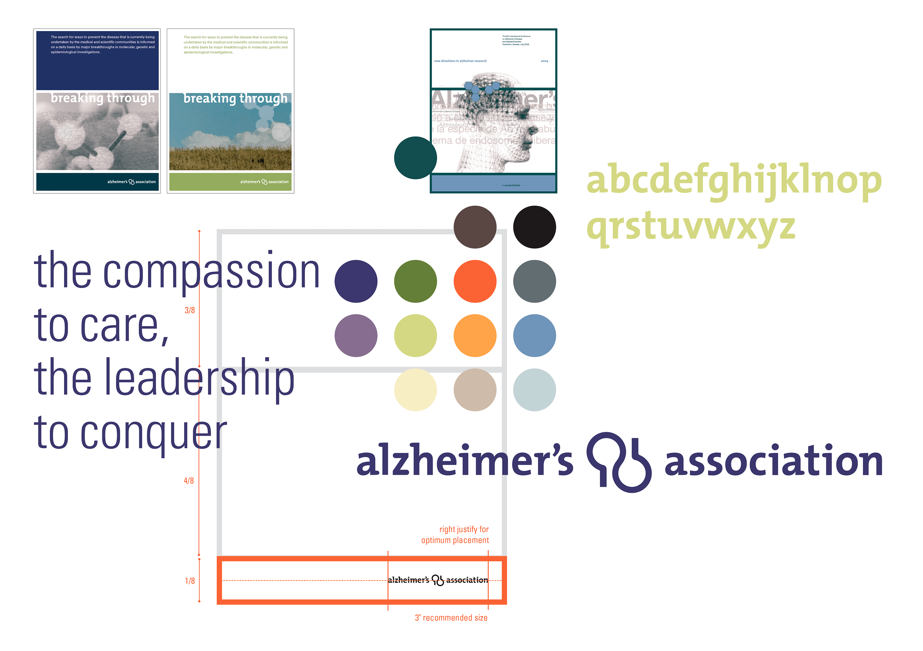
When we began work to rebrand Alzheimer’s Association, the world’s largest private funding source for dementia research, the organization was known primarily for its support network of caregivers. With a much-loved, but outdated logo that reflected only its care-related programs and initiatives, the association commissioned Studio/lab to develop and champion a comprehensive identity program that would align the organization’s brand image with its dual mission of care (people) and research (science).
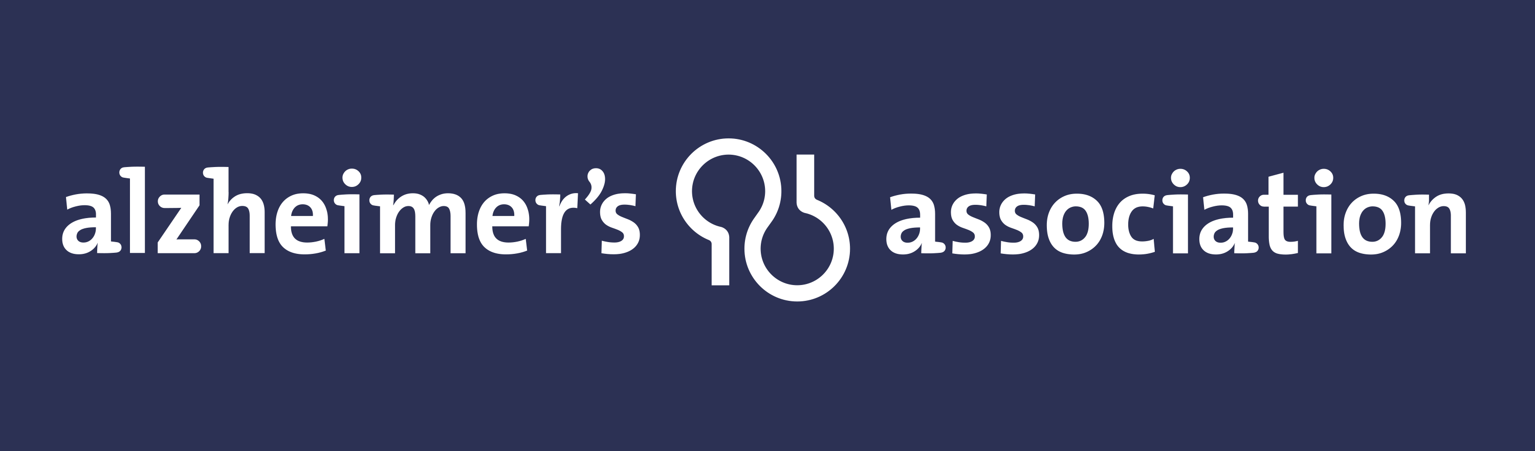
The Alzheimer’s Association symbol is inspired by the yin/yang universal sign of duality. The people+science symbol is designed to suggest additional dualities inherent in the organization and its fight against Alzheimer’s disease: care/research, problem/solution, compassion/power, hope/despair, joy/sadness, etc.
The Alzheimer’s Association symbol is inspired by the yin/yang universal sign of duality. The people+science symbol is designed to suggest additional dualities inherent in the organization and its fight against Alzheimer’s disease: care/research, problem/solution, compassion/power, hope/despair, joy/sadness, etc.