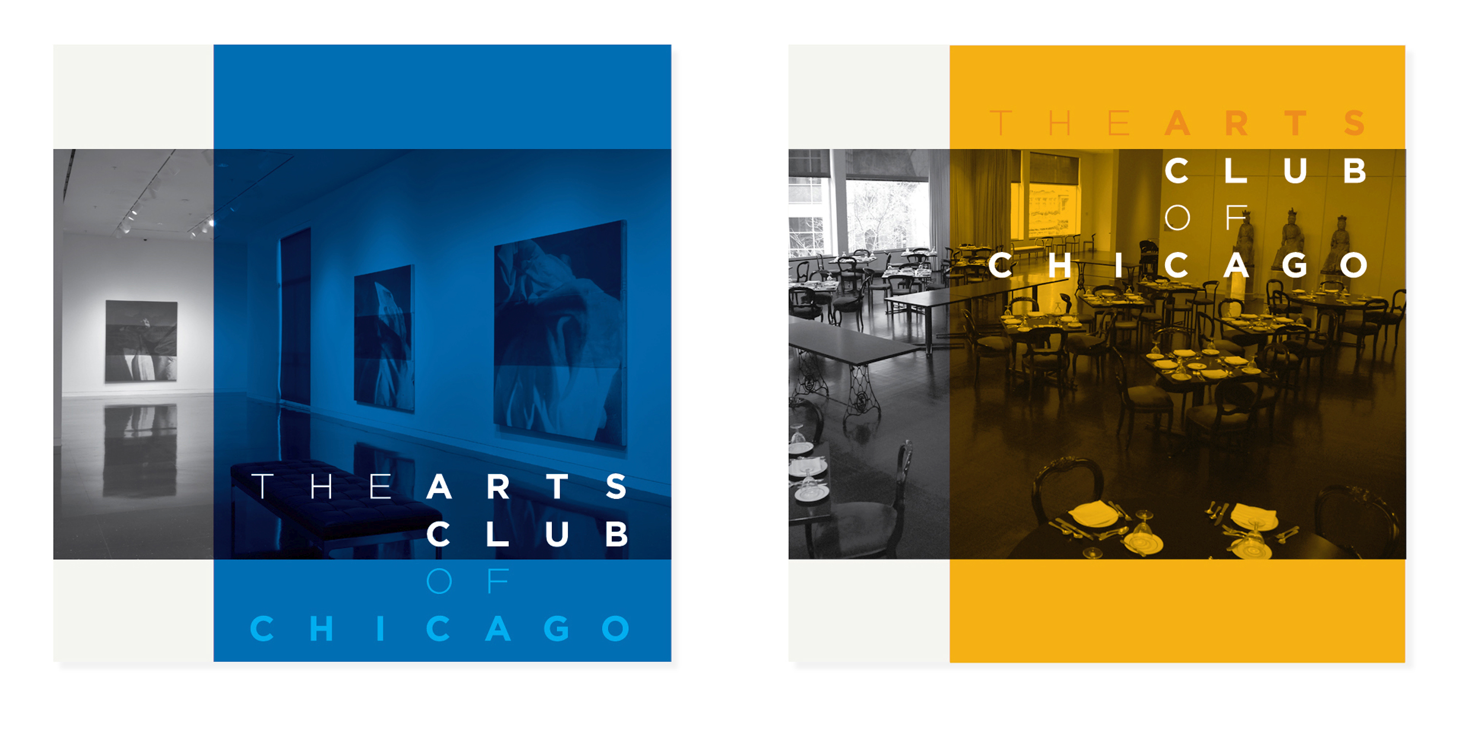
Since 1916, The Arts Club of Chicago has been a preeminent exhibitor of international art, a forum for both established and emerging artists, and a celebrated venue for performers from around the world. In 1951 the Arts Club moved into a space with an interior designed by Club member Ludwig Mies van der Rohe. As the Arts Club approached its 100th anniversary, Studio/lab was invited to develop a visual identity to align with the institution’s historic stature, to represent its understated character, and to reflect its architectural heritage.
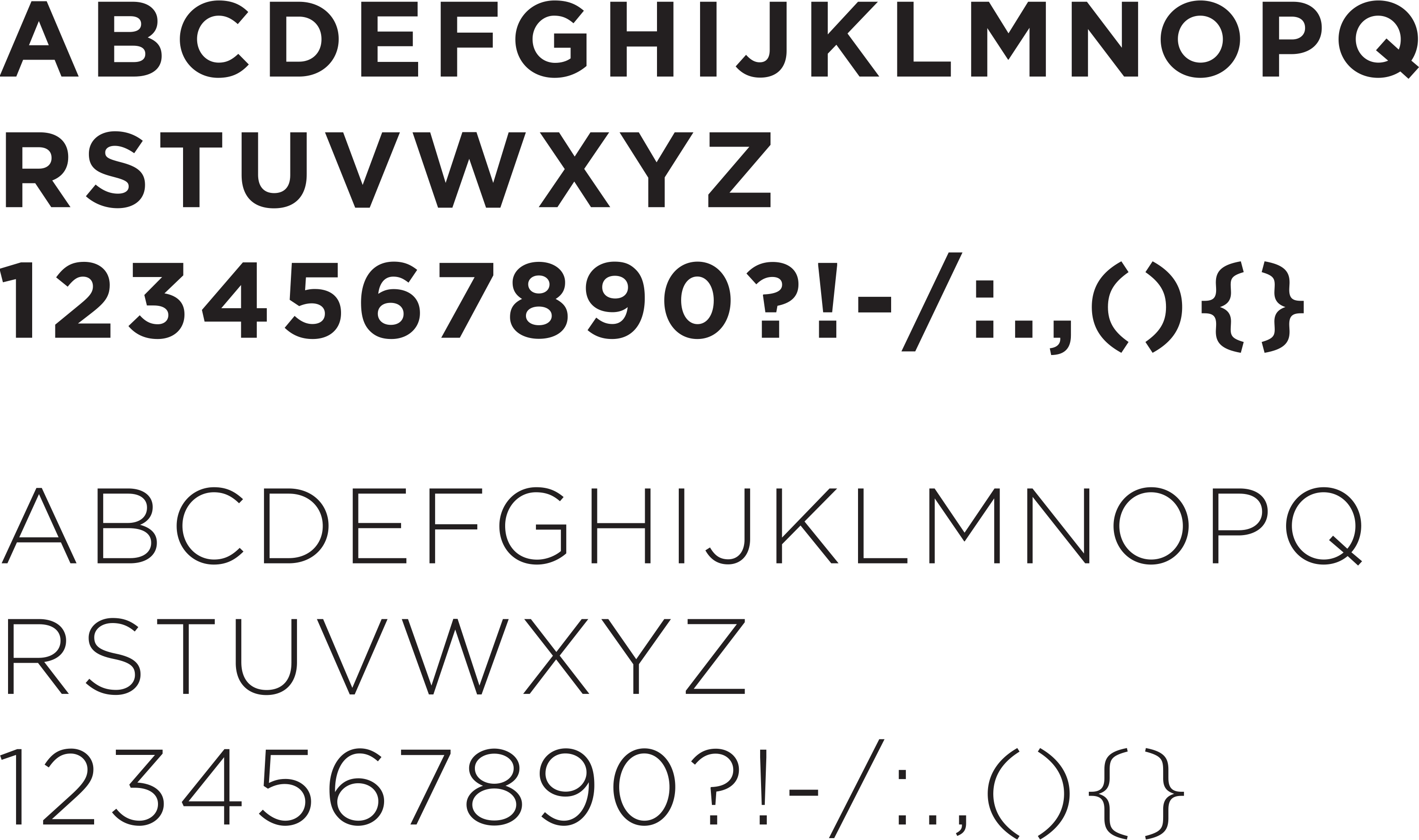
The Arts Club logotype is built from the typeface Gotham. Released in 2000 and designed by Tobias Frere-Jones, Gotham was inspired by Allzweck, a typeface designed by Mies van der Rohe in the mid-twentieth century. Allzweck was used for interior and exterior signage in many of van der Rohe’s landmark buildings. Gotham extends the original design by adding a series of weights from light to bold in addition to lowercase letterforms that were absent from the original designs.
The Arts Club logotype is built from the typeface Gotham. Released in 2000 and designed by Tobias Frere-Jones, Gotham was inspired by Allzweck, a typeface designed by Mies van der Rohe in the mid-twentieth century. Allzweck was used for interior and exterior signage in many of van der Rohe’s landmark buildings. Gotham extends the original design by adding a series of weights from light to bold in addition to lowercase letterforms that were absent from the original designs.


