When Shakespeare Repertory changed its name to Chicago Shakespeare Theater, and its location to a prominent position on Chicago’s Navy Pier, Studio/lab was invited to develop a visual identity that would support the group’s transformation into one of the city’s leading cultural institutions.
The new role of “cultural hub” for Chicago’s most popular tourist destination fit right in with the company’s populist philosophy. Founder and Artistic Director, Barbara Gaines, believes that Shakespeare speaks to everyone. Productions are uniquely vibrant, accessible, and modern. Literally situated on Lake Michigan with a stunning view of the city skyline, ideas of place were to be central to the final typographic solution.
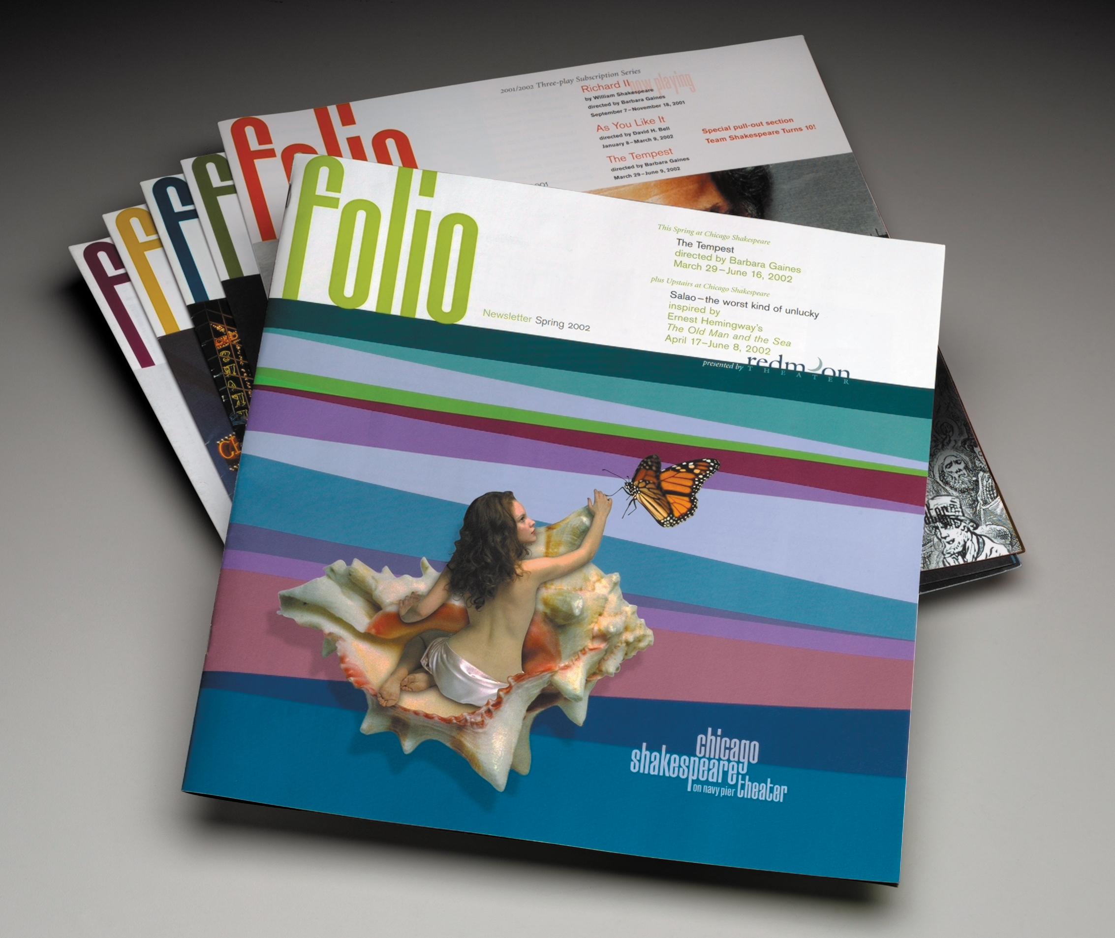
Central to the identity system a is a custom font designed to be irreverent, egalitarian, modern, urban, and, “of the water.” To remove any sense of formality, the font has no capital letters. The powerful, tall, condensed geometry of the letterforms suggest the city’s skyline and the waves of its lakefront.
The new role of “cultural hub” for Chicago’s most popular tourist destination fit right in with the company’s populist philosophy. Founder and Artistic Director, Barbara Gaines, believes that Shakespeare speaks to everyone. Productions are uniquely vibrant, accessible, and modern. Literally situated on Lake Michigan with a stunning view of the city skyline, ideas of place were to be central to the final typographic solution.
Central to the identity system a is a custom font designed to be irreverent, egalitarian, modern, urban, and, “of the water.” To remove any sense of formality, the font has no capital letters. The powerful, tall, condensed geometry of the letterforms suggest the city’s skyline and the waves of its lakefront.