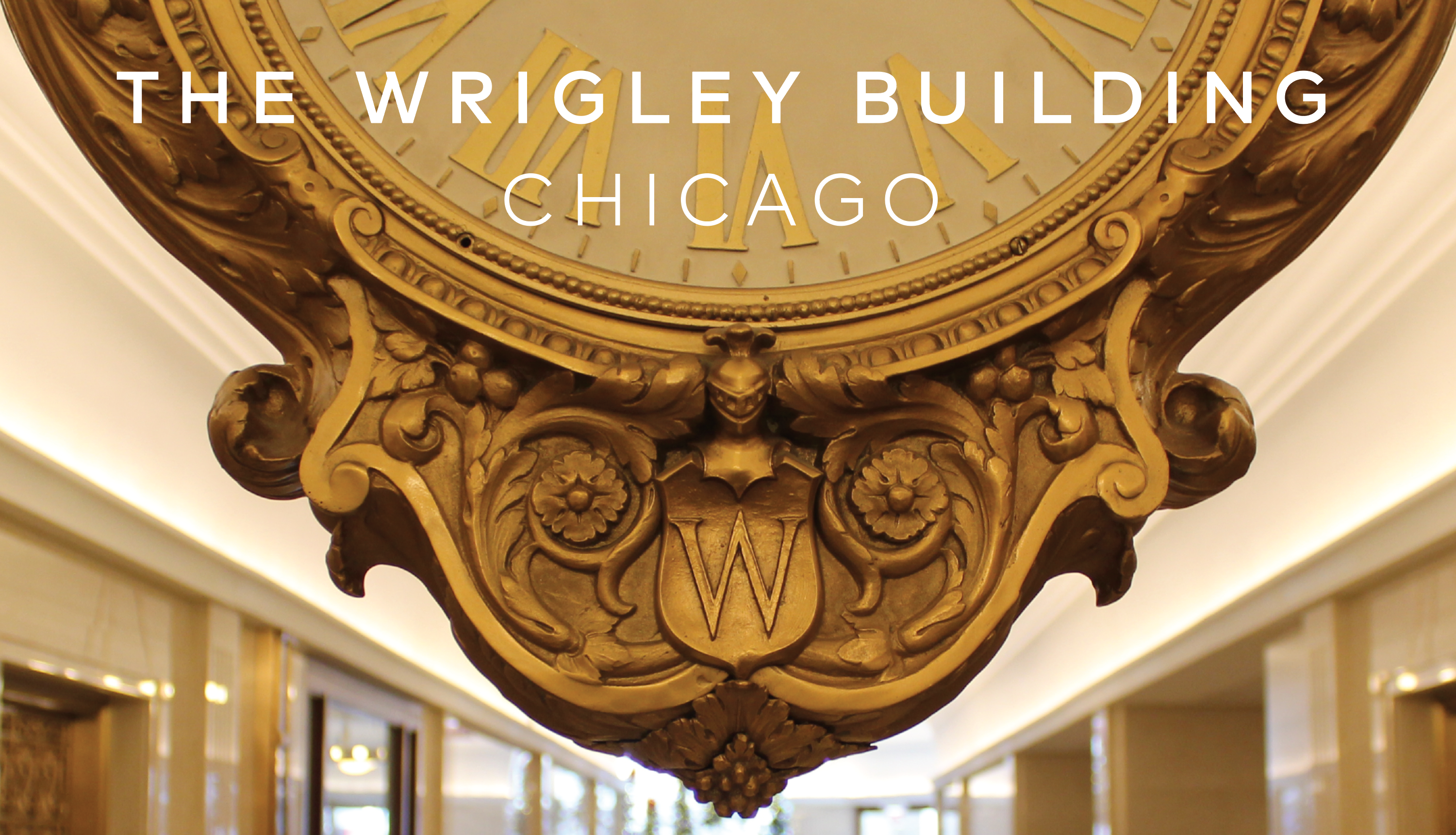
Designed by architects Graham, Anderson, Probst and White, and instantly beloved when it opened in 1921, The Wrigley Building inaugurated Chicago's Magnificent Mile in both time and space. Today, it has become a timeless symbol of an evolving city.
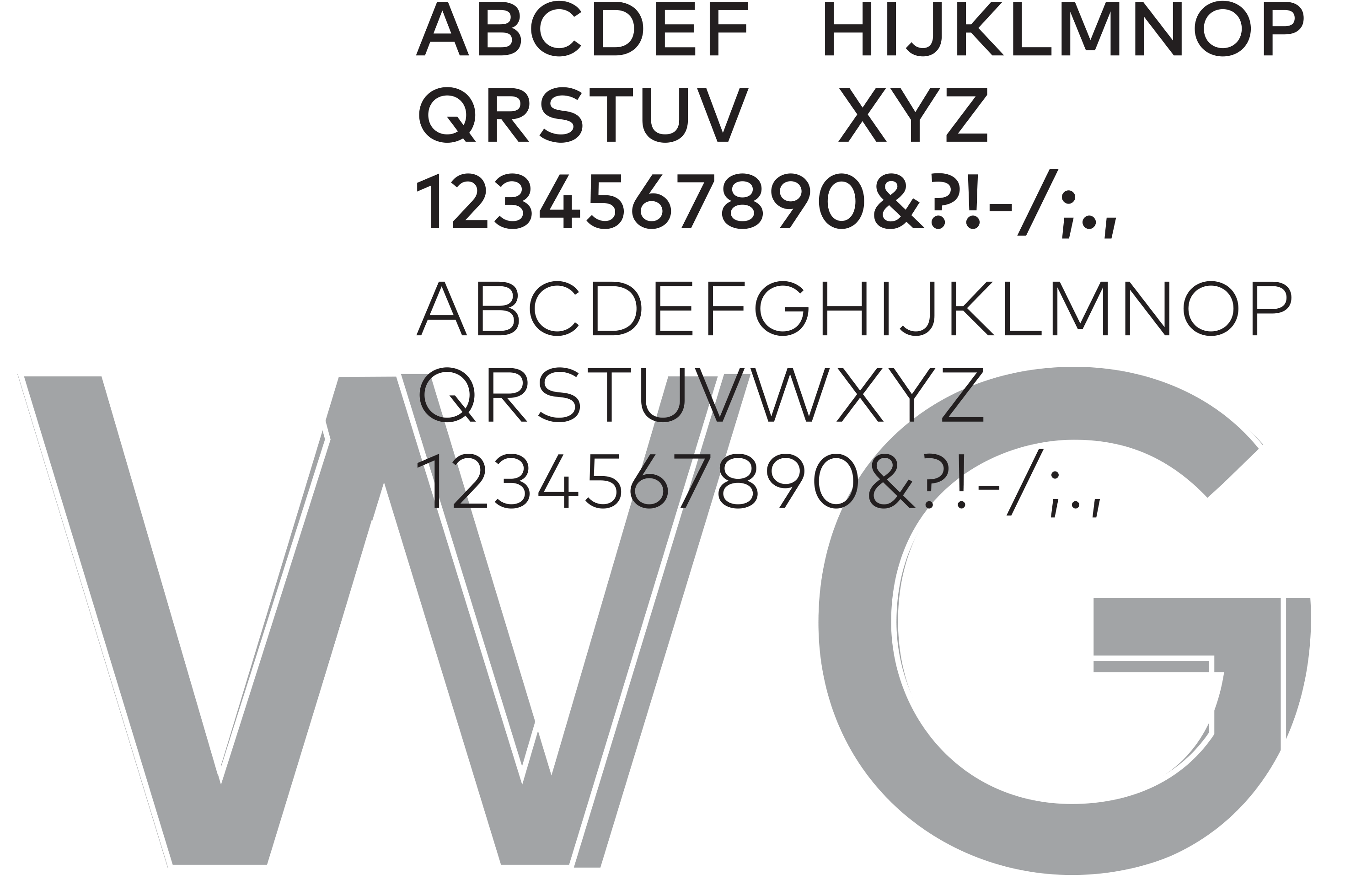
Rooted in history, yet of the 21st century, The Wrigley Building identity originates in brass letterforms found on the south tower directory. Identifying features are retained in a modification ff Mark, a contemporary font that pays homage to early modern typefaces developed during the 1920s when The Wrigley Building came to be.
While working on this project with the building's new owner, Studio/lab simultaneously developed a visual identity and website for the Mansueto family office, which is housed in the landmark location.